[ad_1]
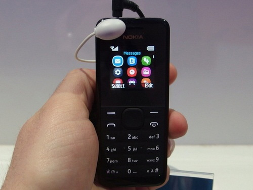
BARCELONA – One of the standout phones of Mobile World Congress costs only $20 and can’t surf the Web. It’s the Nokia 105, a simple voice-and-text phone that looks much classier than you usually get at this price point, and I think it’s poised to be a huge global hit.
I spoke to Stefan Pannenbecker, Nokia’s vice president for industrial design, about the company’s growing design language and how the company’s Lumia line led it to design what is probably the world’s most attractive $20 phone.
The Nokia 105 has two markets: it’s primarily for developing countries where every dollar is precious, and it’s also a secondary phone for people with more dough. At its rock-bottom price, though, it has unusually good-looking industrial design; its high-quality, wraparound plastic case comes in black and lively cyan, the keypad is water-resistant, the battery lasts a month on standby, and the color screen is bright and lively.
It’s no accident that the 105 echoes much of the design language in higher-end Nokia phones: the plastic, the rounded form, and the cyan color all shout “Nokia.” While there’s some corporate identity there, that isn’t the whole story: Nokia used what it learned building high-end phones like the Lumia 900 to design the 105.
“As we kind of refine our skills in certain material technologies and certain ways of constructing products, we can build those learnings into relatively low cost products,” Pannenbecker said.
“It’s simple things like understanding the resins and the plastics that we use, to understand how we can translate the quality of those resins into other grade plastics, [and] which types of pigments we can use and must use to get the best colors. This is very detailed work but it’s really absiolutely crucial,” he said.
The 105 also needed to look like a full member of the Nokia family, not a stepchild. That led to the 105’s “pure, human” shape, echoing the rounded design of othe Nokia phones.
“We’re pushing this idea of continuity and consistency,” Pannenbecker said. “So we put the same amount of love, sweat and tears into a product like this as we would put into the Lumia 720.”
Part of Nokia’s recent identity has been to bring color back to phones, and that contributed to the 105 as well, Pannenbecker said. It’s expensive to make, stock, and manage a range of different-colored devices, so Nokia couldn’t spray out a rainbow of 105s. Instead, the designers could pick two colors, so they took a “neutral” color, black, and an “iconic” color, that Nokia cyan.
With the first Lumia phones, “we wanted to complement the purity of the physical design with the purity of the color, so we used a color approach we called CMYK, the abbreviation of the basic printing colors … and now when people see a cyan-colored product they think Nokia, which is great,” he said. “People identify Nokia with color very strongly now.”
The Nokia 105 sadly won’t come to the U.S. because it’s incompatible with our networks, missing any frequency bands we use. But I hope Nokia reconsiders; I think a well-built, inexpensive voice phone could find a home in every nation.
For more, see PCMag’s Hands On With the Nokia 105 and 301 and the slideshow above.
[ad_2]
Source link : https://www.pcmag.com/news/how-nokia-made-a-beautiful-20-phone-the-nokia-105
